Content Media Carousel


There are no ACF fields assigned to this component.
@import "../../resources/scss/util/variables";
@import "../../resources/scss/util/mixins";
@import "../../resources/scss/vendor/bootstrap/vendor/rfs";

.block-media-carousel {
	overflow: hidden;
	position: relative;

	&__meta {
		display: flex;
		flex-direction: row;
		gap: rem-calc(16);
		flex-wrap: wrap;
		align-items: center;
		justify-content: space-between;
		@include margin-bottom( rem-calc(60) );

		.heading {
			margin-bottom: 0;
		}

		.btn {
			margin-right: 0;
		}
	}

	.swiper {
		overflow: visible;

		&.swiper-initialized {
			display: flex;
		}

		&:not(.swiper-initialized) {
			.swiper-wrapper {
				display: flex;
				flex-direction: row;
				flex-wrap: nowrap;
				gap: rem-calc(30);

				.swiper-slide {
					width: 85%;

					@include bp(600px) {
						width: 85%;
					}

					@include bp(768px) {
						width: 55%;
					}

					@include bp(992px) {
						width: 40%;
					}

					@include bp(1400px) {
						width: 39%;
					}
				}
			}
		}
	}

	.swiper-slide {
		display: flex;
		flex-direction: column;
	}
}
class MediaCarousel {
	/**
	 * @param {object} block
	 */
	constructor( block ) {
		this.block = block;
		this.swiper = null;

		ScrollTrigger.create({
			trigger: this.block,
			start: 'top bottom',
			end: 'bottom top',
			onEnter: () => this.initialiseSwiper(),
		});
	}

	initialiseSwiper() {
		if ( this.swiper ) {
			return;
		}

		this.swiper = new Swiper( this.block.querySelector( '.swiper' ), {
			slidesPerView: 1.25,
			spaceBetween: 30,
			speed: 600,
			navigation: {
				nextEl: this.block.querySelector( '.swiper-button-next' ),
				prevEl: this.block.querySelector( '.swiper-button-prev' ),
			},
			breakpoints: {
				600: {
					slidesPerView: 1.5,
				},
				768: {
					slidesPerView: 1.75,
				},
				992: {
					slidesPerView: 2.25,
				},
				1400: {
					slidesPerView: 2.5,
				},
			}
		});
	}
}

document.querySelectorAll('.block-media-carousel').forEach((block) => {
	new MediaCarousel( block );
});
Page Title
Page Type
Page URL
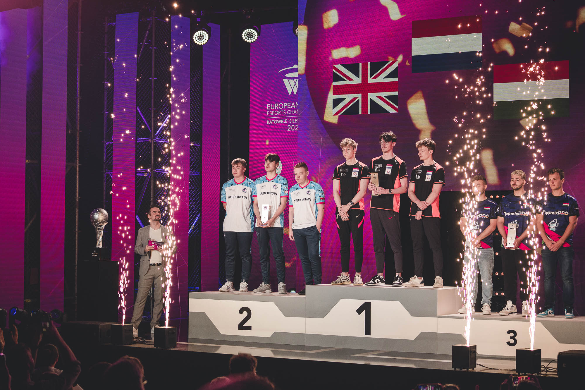
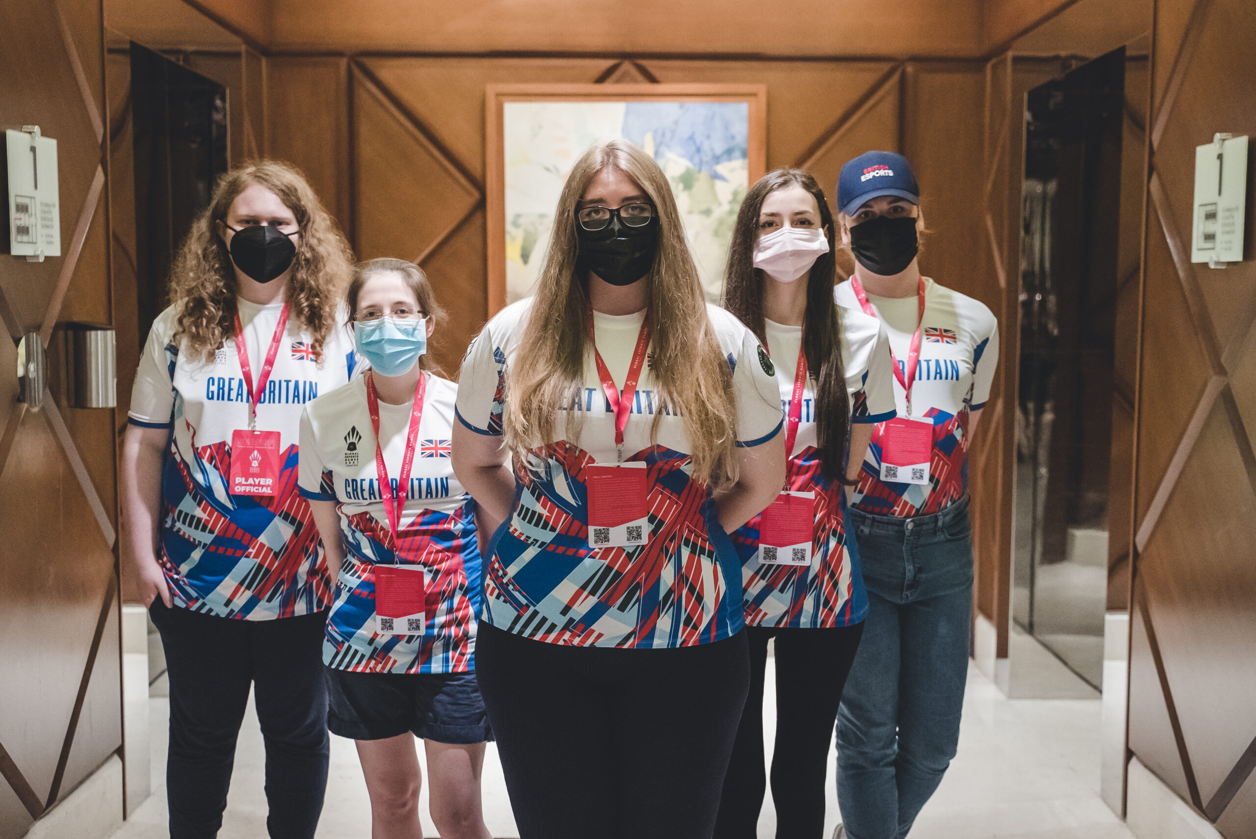
Great Britain & NI
page
- Select images or videos from the media library to display
- Images show at a larger size in a lightbox
- Videos launch and play in a lightbox
- Video data controlled from CPT. Can be youtube, vimeo or mp4
Animation: